Yay! It’s here! The Pantone color report for Fall 2017! If you’re new to Fabmood, we’ll explain. Each season during Fashion Week, the color technologists at Pantone take note of particular color trends they see on the runways of the top fashion designers who are previewing their upcoming collections. Then they release a report of their predicted top 10 popular colors for the pending season. Last Fall, the color palette was led by shades of strong blue, and the color report expressed a lean toward promoting optimism, tranquility and strength in those hues.
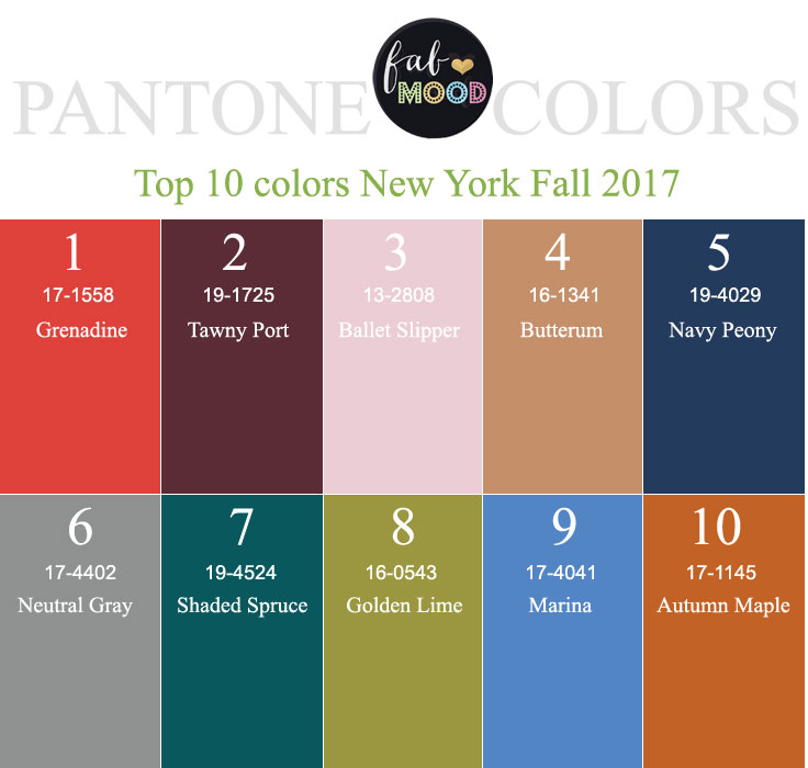
The 2017 Fall colors, conversely, are led more by warmth. In addition to the classic autumnal palette which includes Tawny Port, a Butterrum neutral, and Navy Peony, this year’s trend is bookended in a vibrant red-orange – Grenadine – and two funky shades of Golden Lime and Autumn Maple which bring up a 70s retro vibe for me. For the softer feminine side, we have a Ballet Slipper Pink. Words that Pantone’s experts are using to describe the palette include sophisticated, vibrant, and refreshing.
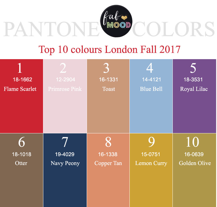
Pantone Fall 2017 London Color Trends
Pantone Fall 2017 New York Color Trends
What’s more, Pantone’s team discovered this year enough of a difference between their color reports from New York to London to include a second palette specific to the London trends. Even though the London colors include similar neutral anchors like Otter brown, Toast, and Golden Olive, there are some surprising color choices for typical fall fashion. Bright colors typically associated with springtime are included, like Royal Lilac, Bluebell, Primrose Pink and Flame Scarlet.
I’m really looking forward to seeing how these color palettes play out in the wedding design world. I’ve got my homework ahead of me – finding lots of examples and inspirations combining these fun colors into contemporary designs for all you brides who are in the early stages of brainstorming trendy themes for your big day!
